
213
Tool Creation |Application Methodology
212
Tool Creation |Application Methodology
Various forms of data can be visualized and mapped out during the simulation and toggled on or off via the GUI (Graphical User Interface) or hotkeys
Simulated and screen-recorded by Author.
Data visualization sequential frames
Frame-captured by Author.
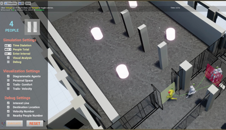
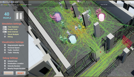
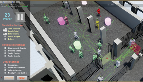
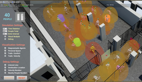
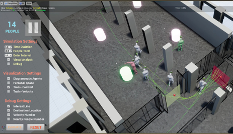
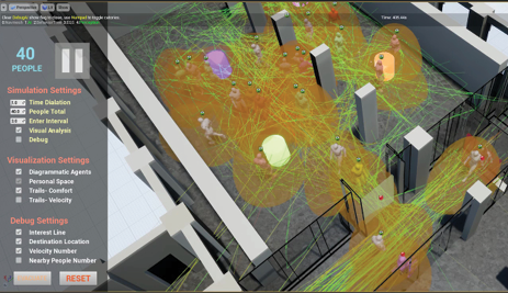
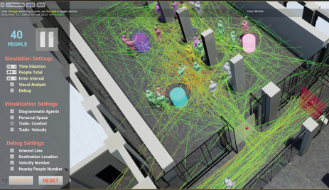

Figure 3.6.9 - 3.6.10
Due to the calculated nature of agent-based computer-generated simulations, it
becomes straightforward to render out various forms of data during the simulation
process. One example of such is the agent’s comfort level throughout the space. This
is calculated based on the number of other agents within the agent’s personal space
(visualized by the red bubbles). The more people within this personal space, the less
comfort the agent has, and the redder the resulting trail will become. As seen in
the figure, areas of discomfort appears in red, which can be used to map out crowd
densities where congestion may occur. This map seems to make logical sense in this
case since the location of it is by an object of interest as well as being in the most central location of the space.
This is of course, just one example of how data can be mapped throughout the simulation. Depending on the spatial and scenario typologies, multiple layers can be visualized and traced based on varying types of occupancy throughout the space. A hospital might have different paths for the doctors and the patients; a school might have different paths for the teachers, students, and the general public; a store might have different paths for employees and shoppers. As such, by visualizing this data in real time, it becomes possible to not only better design circulation to accommodate everyone during the design phase, but also visualize neglected spaces that can be optimized.
1
3
5
7
2
4
6
8


